(Click on the image above for High-Res Image, or Download the PDF for best quality)
Introduction
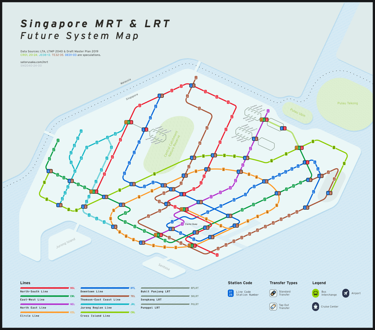
Back in 2017, I embarked on a personal project to redesign the Singapore MRT system map, driven by curiosity and a fascination with transit maps. In 2019, I released my first redesign, sharing it on the Singapore sub-reddit. With no formal background in design, I approached this as a hobby and a passion project.
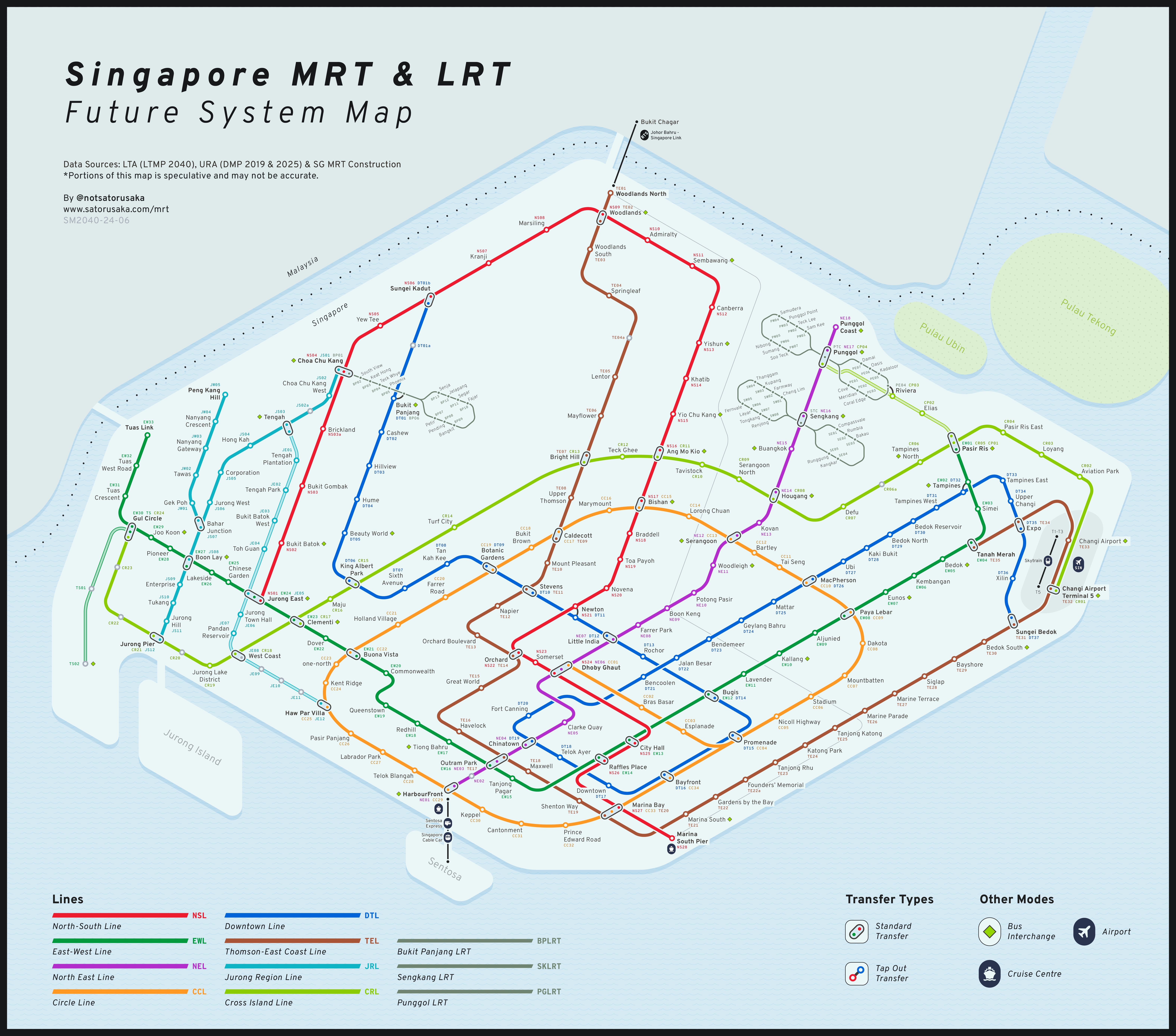
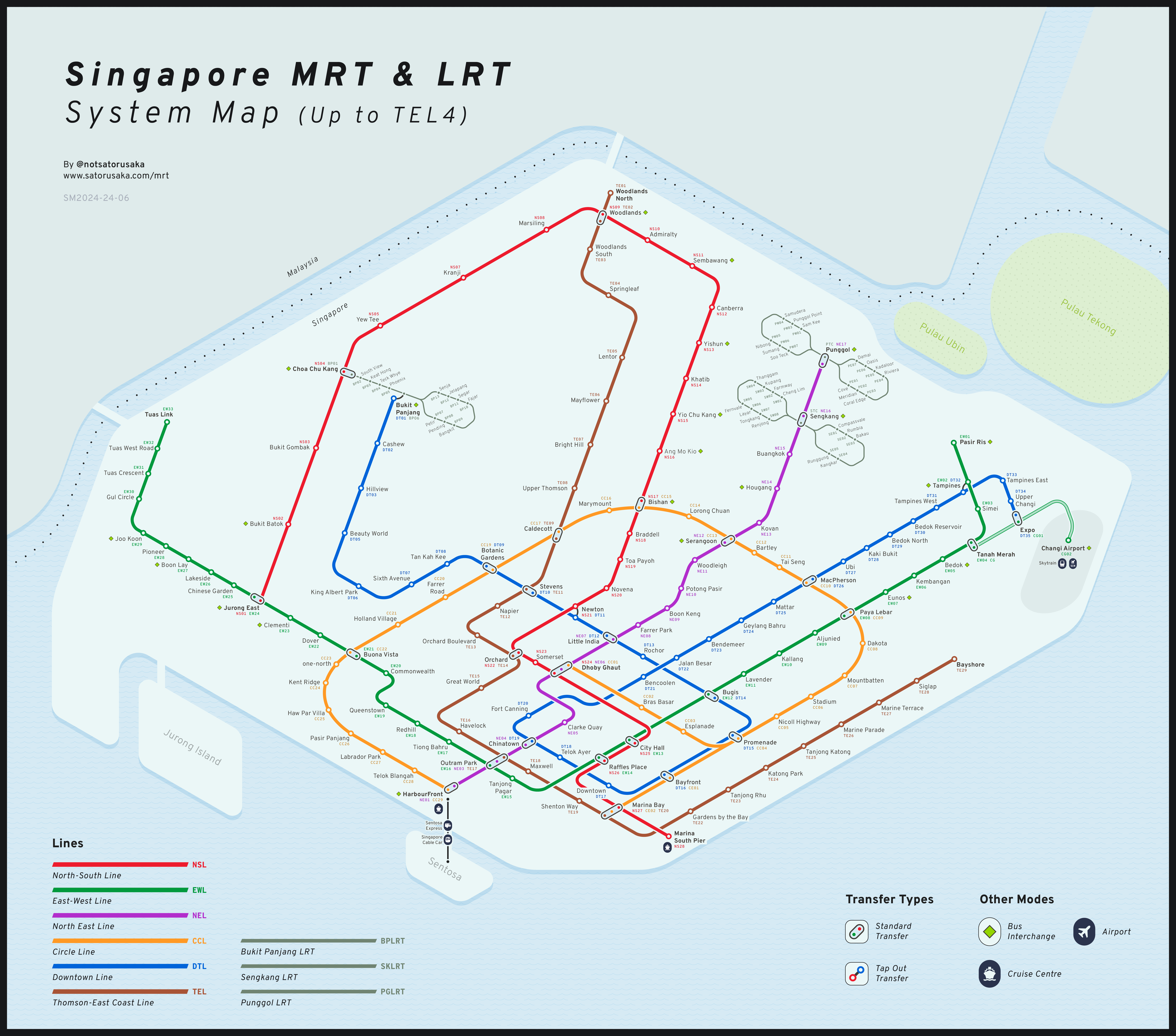
With many updates announced by the Land Transport Authority (LTA) since then, I decided it was time for a new iteration. This new project, taking about three months of intermittent work, allowed me to experiment with fresh ideas and create something entirely new. In this post, I’ll walk you through my design process, highlight the key features of my map, and compare it with the official MRT map.
Background
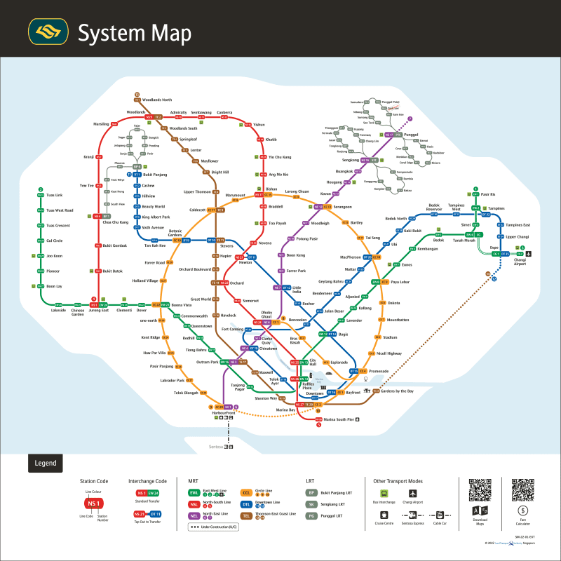
The latest official MRT map redesign was unveiled in late 2019, around the same time I released my first redesign. While the official map has its merits, there were several aspects I believed could be improved. For instance, making the Circle Line a perfect circle, although visually appealing, resulted in a disproportionate map where the Central Business District (CBD) area became cluttered, and the Singapore River added unnecessary visual noise. Additionally, the LRT lines seemed overly prominent relative to their smaller capacity, contributing to the map’s overall cluttered feel.
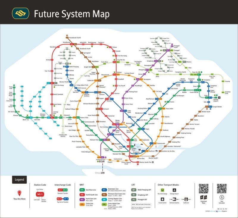
In my research, I explored various metro diagrams from around the world, noticing some did not adhere strictly to the conventional 45/90-degree angles. I also drew inspiration from Jug Cerović’s redesign of the Singapore map, which utilized 30-degree angles. These insights inspired me to experiment with new angles and approaches.
Design Process
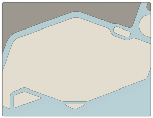
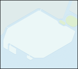
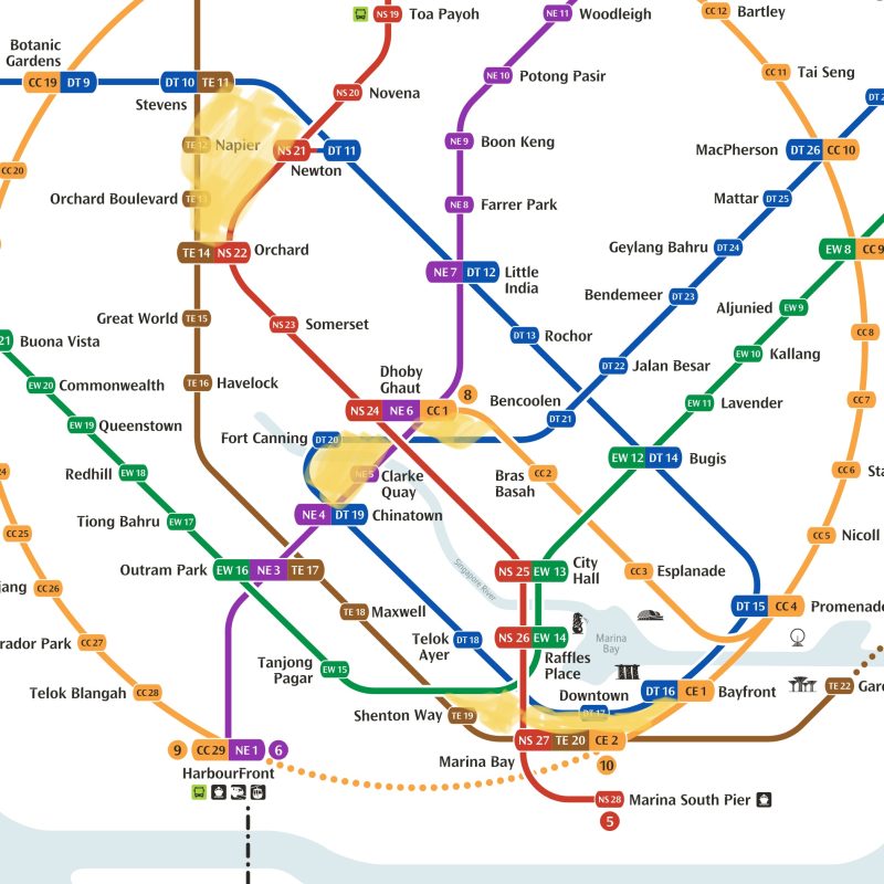
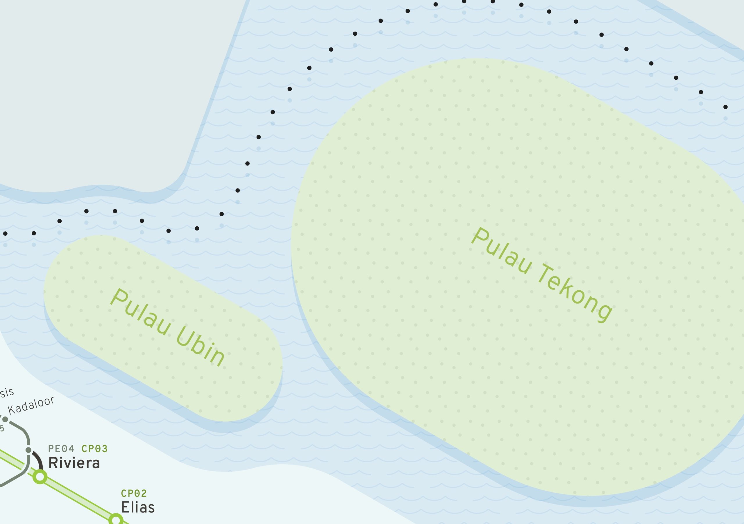
Shape of Singapore: One of my primary goals was to create a visually pleasing representation of Singapore, including the four major islands. Unlike previous maps where the shape of the island felt like an afterthought, I wanted it to be a central element, giving the map a unique identity.
Line Tidiness: I aimed to eliminate awkward negative spaces and odd angles found in the official map. This required careful planning and experimentation with different layouts.
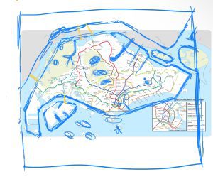
Tools and Techniques: I used Apple’s Freeform app on my iPad for initial sketches, Adobe Illustrator for detailed design work, and Autodesk Fusion for precise line layout and map shaping. The CAD software allowed me to maintain consistent angles and dimensions, making adjustments easier.
Angles and Layout: I began by sketching the outline of Singapore, finding that a 20-degree diamond shape fit well with the island’s shape. However, this angle posed challenges for station name placement. After testing 25-degree and 30-degree angles, I settled on 30 degrees as a balanced choice, maintaining the island’s shape while ensuring legibility of station names.
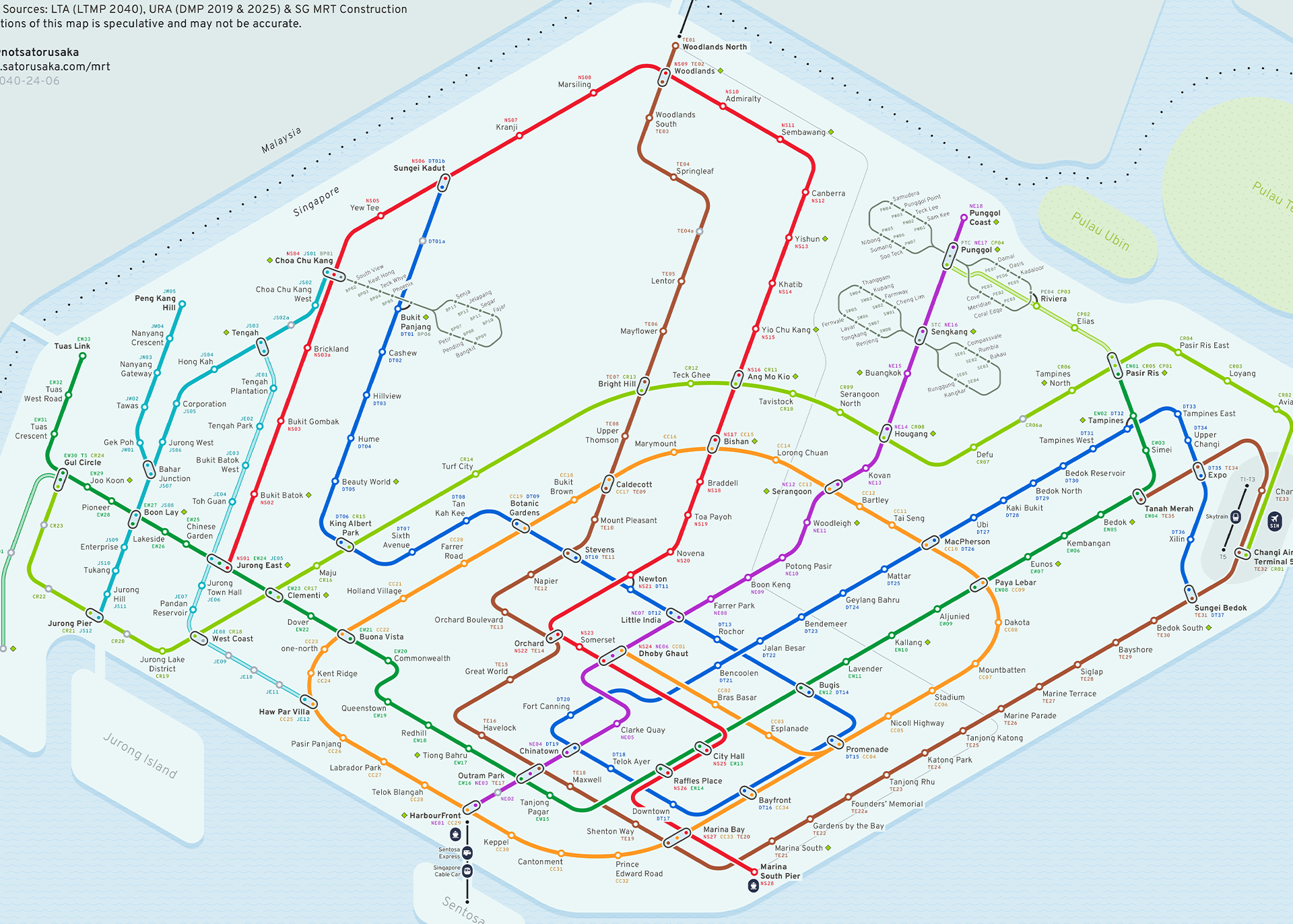
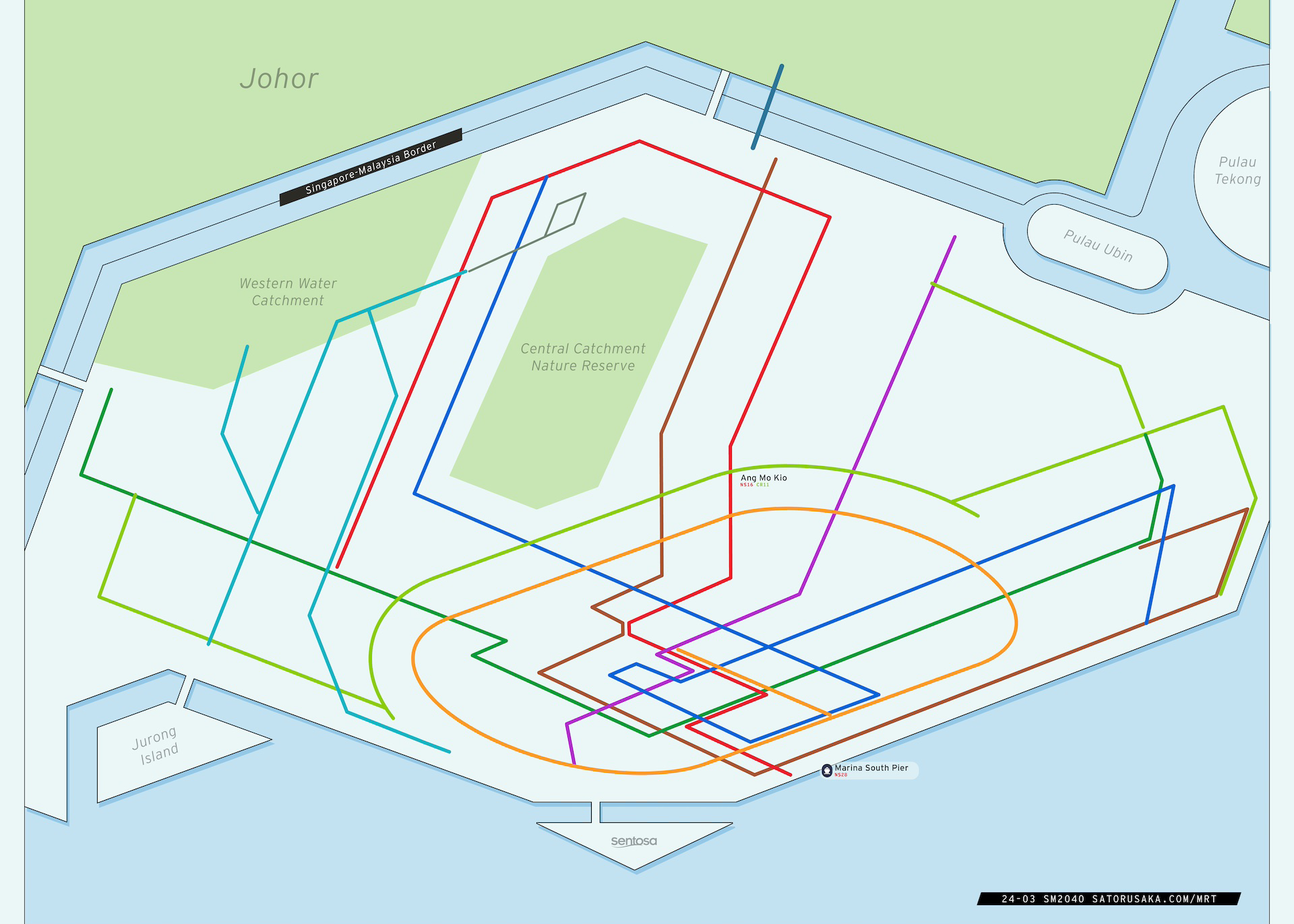
Circle Line Design: Initially, I used a “running track shape” for the Circle Line, similar to my previous redesign. However, fitting this shape onto the diamond-shaped Singapore proved difficult. After several iterations, I adopted a diamond shape for the Circle Line, which better aligned with the rest of the lines and the island’s shape.
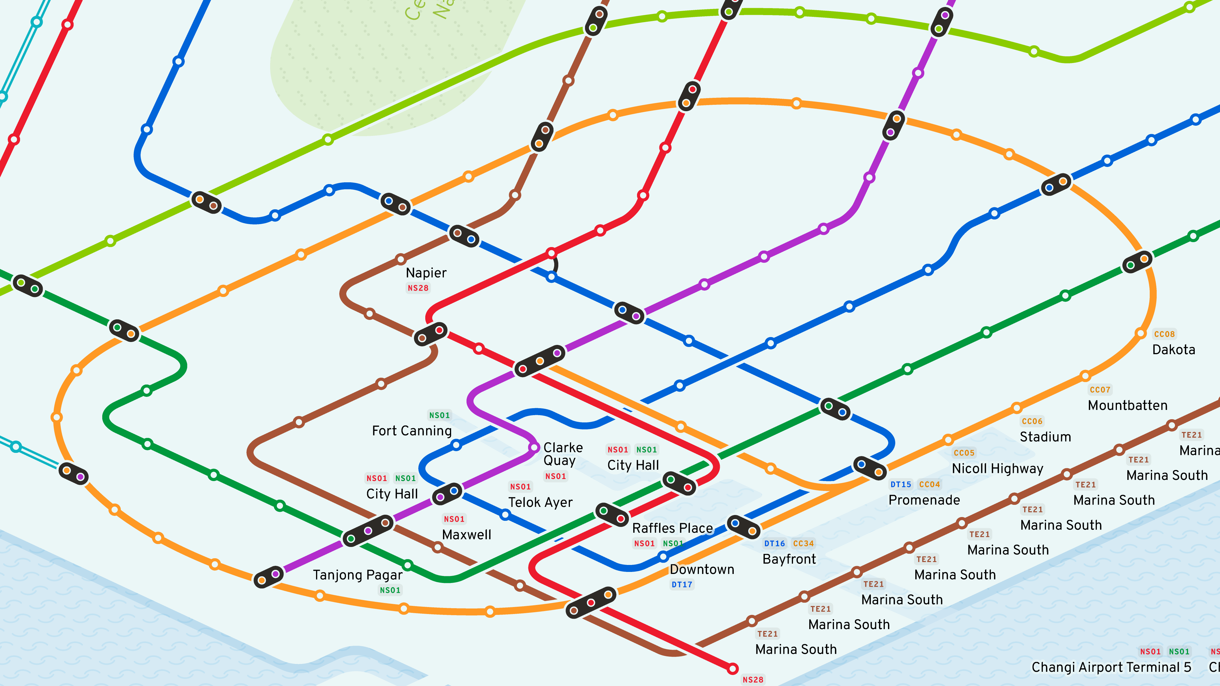
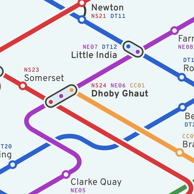
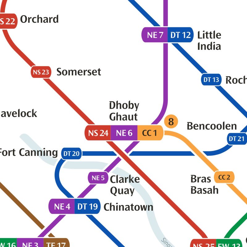
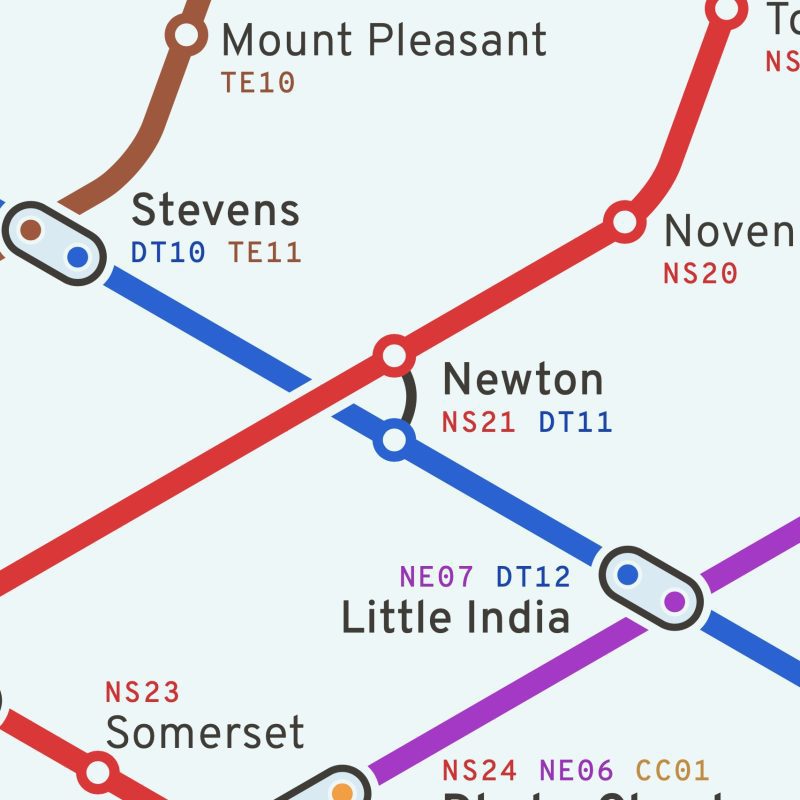
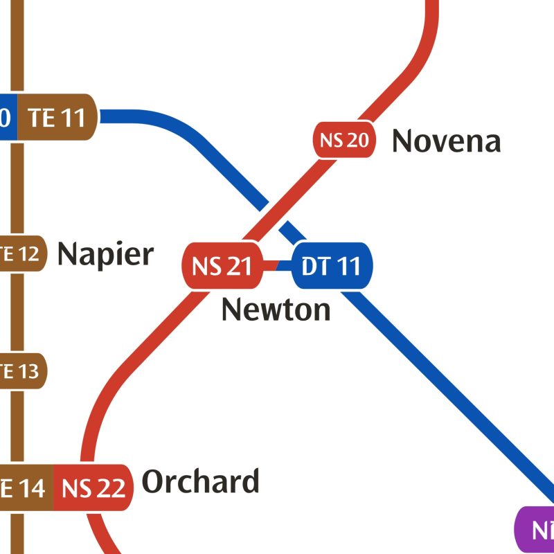
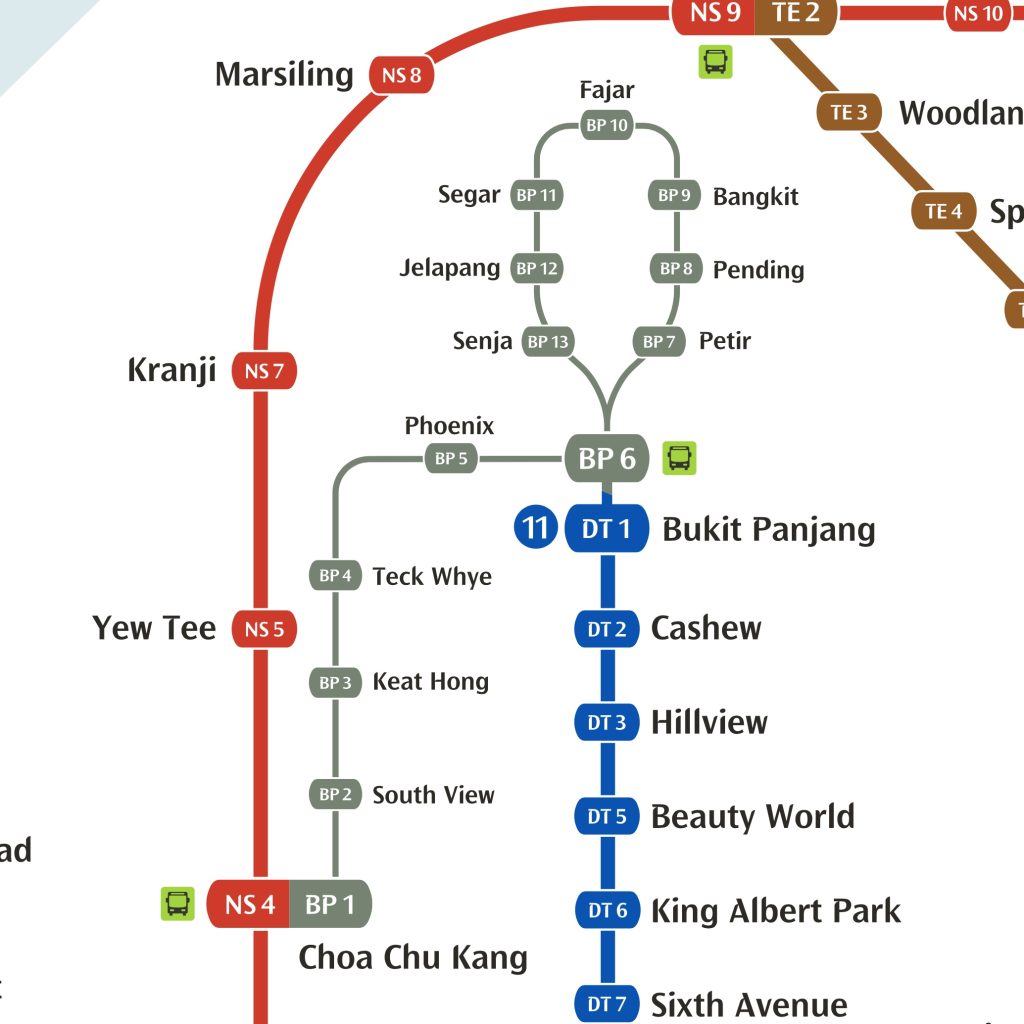
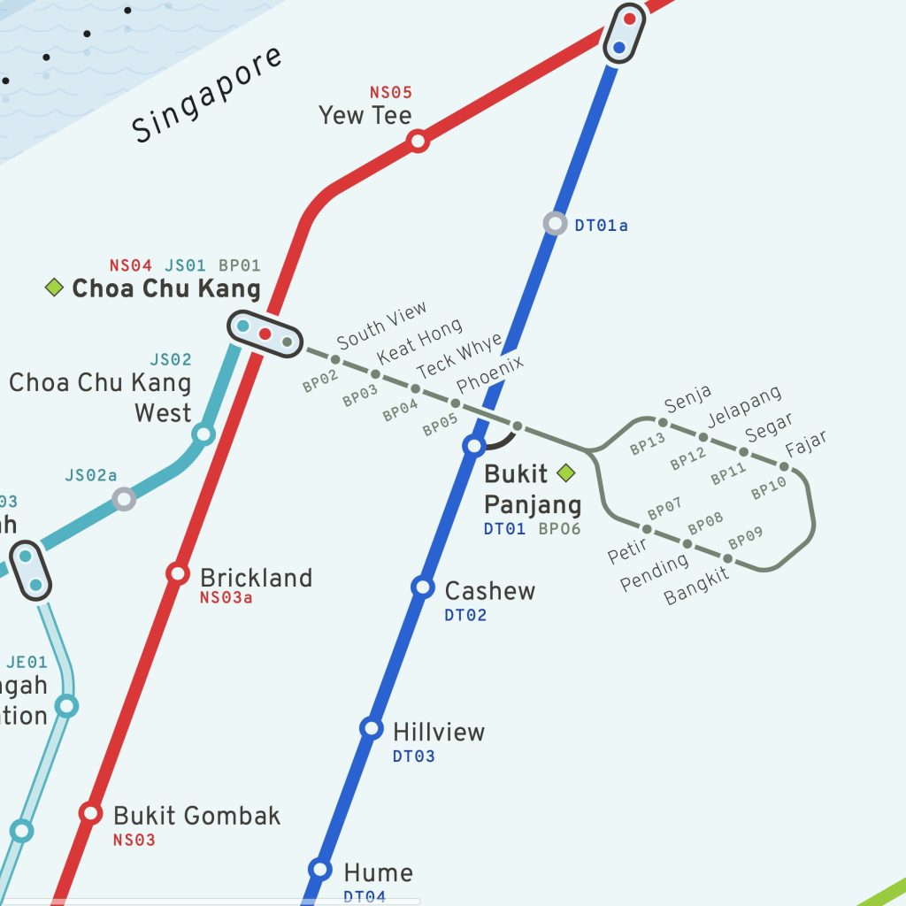
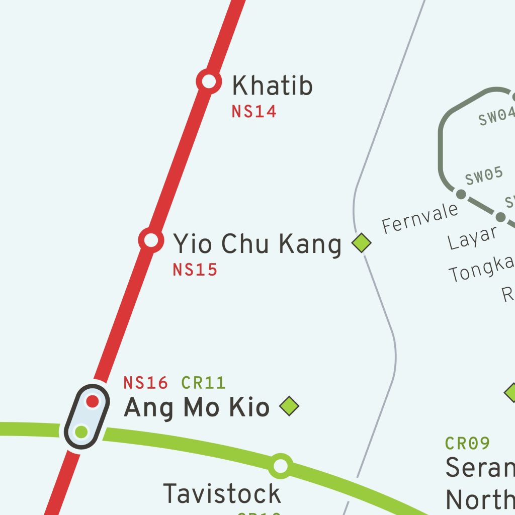
Station Markers: I experimented with different ways to display station codes, ultimately preferring station markers over caplets. This decision was supported by feedback from my Instagram followers, with 67% favoring station markers. I found station markers less intrusive and easier to follow.
Comparing Station Markers with official Caplets
Key Features of the Redesign
Color Palette: I chose a soft light palette for the map to improve contrast without using a stark white background. For the lines, I adhered to the official colors to maintain familiarity.
Line Layout: I designed the lines to be long, straight, and parallel, creating a neat flow towards the CBD area. This organized structure enhances the map’s readability.
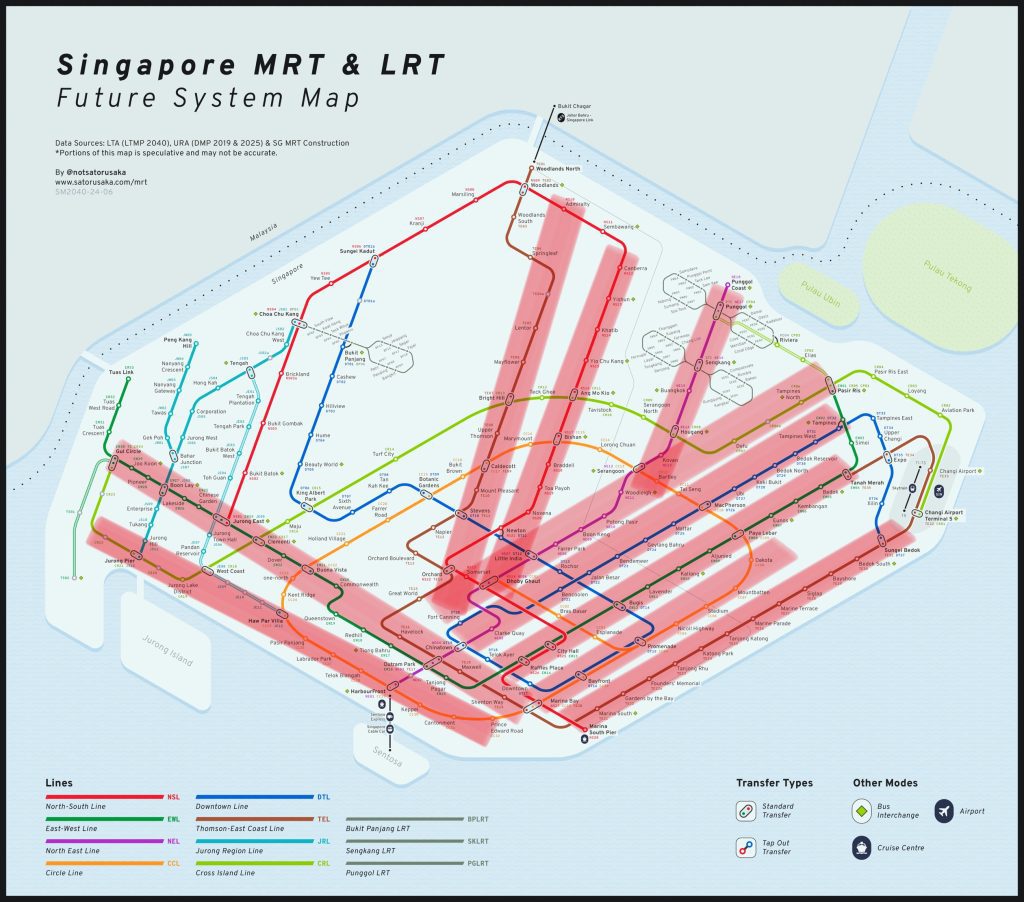
Text Placement: Consistent text placement across the map makes it easier to quickly locate station names, even in dense areas like the CBD.


Font Choice: I selected Overpass, a font based on Highway Gothic, for its readability even at small sizes. This ensures legibility on devices like smartphones.
LRT Line Representation: I reduced the prominence of LRT lines to reflect their smaller capacity and local area service, enhancing overall map clarity.
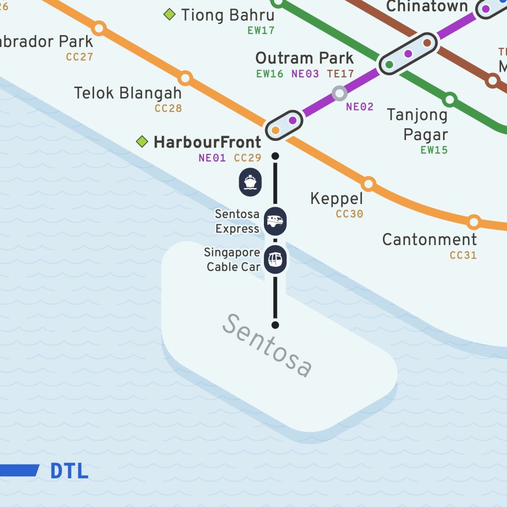
Bus Interchange Icon: I replaced the bus interchange icon with a simpler diamond shape, improving visibility and reducing clutter on mobile devices.
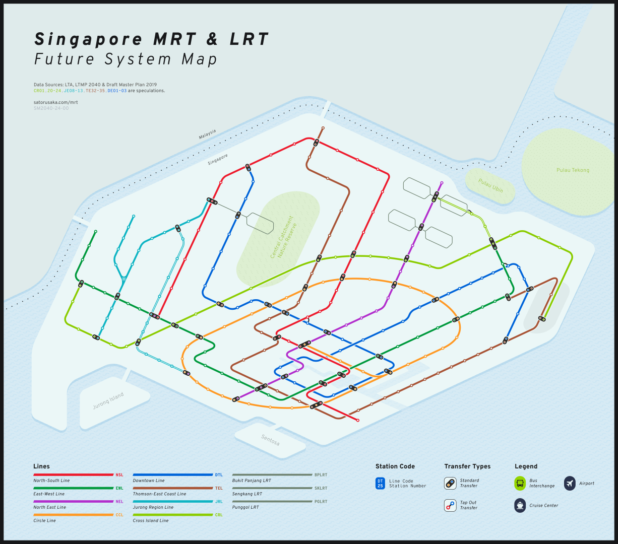
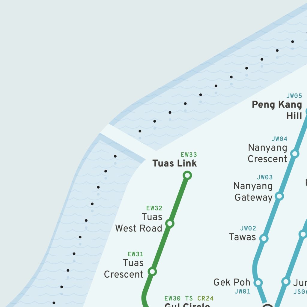
Future-Proof Design: My map includes all future lines, allowing for a balanced layout that doesn’t require expanding the island’s shape to accommodate new routes.
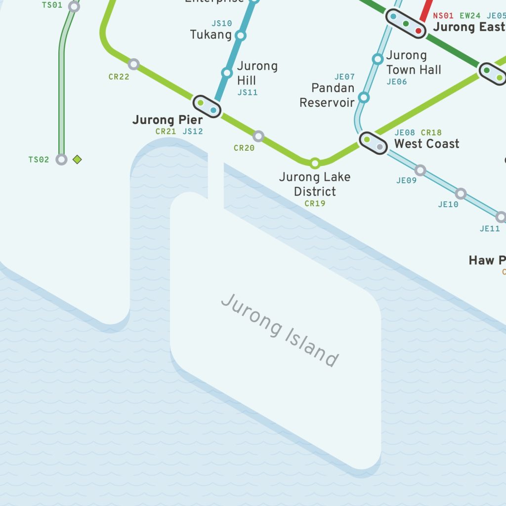
Geographical Alignment: I ensured stations align closely with real-world landmarks, such as Tuas Link near the Second Link and Jurong Pier near Jurong island Highway. This alignment enhances the map’s geographical accuracy.
Aesthetic Touches: Simple patterns for the islands and water add a playful element and subtle texture to the design, making it visually appealing without overwhelming functionality.
Conclusion
Creating this redesigned MRT map was a labor of love, blending my passion for transit maps with a desire to explore new design ideas. I hope this project not only improves upon the official map but also inspires others to appreciate the art and science behind transit map design. I would love to hear your thoughts on my redesign and any suggestions for further improvements.
Please feel free to share this map with your family and friends. The more feedback and perspectives I receive, the better I can refine and enhance the design. Your support and engagement mean a lot to me and can help this project reach a wider audience.
Explore More
If you enjoyed this redesign, be sure to check out some of my other projects on the blog:
Comment Below! Your feedback and interest in these projects help me grow as a designer and bring more exciting ideas to life. Thank you for your support!
I also want to give a special thanks to Hagen Yap (@stormfire_transportation) for helping me to QC my silly mistakes and giving me suggestions and feedbacks.
Socials
you can find me at
- @notsatorusaka – my transit oriented account
- @Jimmy_Lye – my personal account
- jimmylye.com – my portfolio site
Or you can contact me via the contact form.


Leave a Reply